Misleading using numbers

I wanted to call this topic Lies, damned lies and statistics but the point I want to make would have got lost in general talk about misleading advertising, which is already covered in a number of topics. My aim is to provide somewhere to put examples of where the purchaser and the citizen is possibly, or definitely, mislead by the use of statistics. It would also be a place to ask questions about that topic.

My first case popped up in this topic , where a quote from the mobile phone provider Belong was reproduced, which follows marked (1).

(1)

We use parts of Telstra’s mobile network and reaches more than 98.8% of the Australian population (and covers more than 1.6 million square kilometres of Australia).

If you want to show your mobile coverage for both population and land area there are a number of ways to do it. Here are three more that are fairly simple.

(2)
We use parts of Telstra’s mobile network and reaches more than 26,340,000 of the Australian population (and covers more than 1.6 million square kilometres of Australia).

(3)
We use parts of Telstra’s mobile network and reaches more than 26,340,000 of the Australian population (and covers more than 20.8 % of Australia).

(4)
We use parts of Telstra’s mobile network and reaches more than 98.8% of the Australian population (and covers more than 20.8 % of Australia).

Firstly I want to assume that their measurements are accurate, that is the four statements all have true figures that are close enough to reality for the purpose.
The aim of showing the figures four ways is to look at which approach provides the clearest and most useful information to the reader - which is not the same as being true.

Method (2) is the raw data. Its weakness is that most people do not have comparative numbers at hand, if you want to know how likely you are to get a connection these numbers are probably not much use.

Method (4) is expressing the fraction of people and places where you will get coverage. In my view this is the most useful as it makes it plain that coverage is pretty good where there are a lot of people (cities and towns) but there is a great deal of Oz off the beaten track where there is none.

So why would Belong use method (1) which is partly one approach and partly the other? Because, despite being accurate, it makes plain what is good and obscures what it bad. Isn’t that a short description of advertising?

Please add your own examples for discussion.
8 Likes

Interesting topic.

Here’s one example.

Say for every 100 road deaths, 2 are cyclists. Or 2%. Normally.

But this year, say, there have been 4 deaths, and the authorities loudly trumpet that the cyclist deaths have gone up by 100%, which is technically true, and we must therefore build more bike paths and restict traffic flow more.

But the reality is that cyclist deaths have increased by 2% in the overall road deaths, which hardly warrants urgent action.

2 Likes

OK

That’s not so clear. Do you mean 4 deaths in total or 4 per hundred? I think you mean total in which case we have to know the total number of deaths in all categories to derive a percentage of cyclists’ deaths of all deaths after the count went up by 4, which you don’t have in your example.

2 Likes

Four deaths per hundred. Clear now?

1 Like

Any possibility we could look to some real stats and whether they are presenting the results in the best light?

EG.

Our hardworking police, intrepid news reporters and shining political lights often point to the stats.

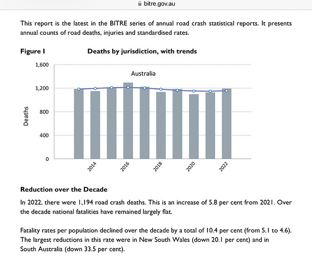
The most often reported stat compares this years road toll with last year. Over the 12 years including 2022 as the latest we are repeatedly reminded the national road toll has not fallen. One version of the facts.

Note the second underlying paragraph offers a slightly more positive outlook. Look a little further into the report and note the road toll has not increased despite a 12.4% population increase, a 20.4% increase in vehicles on the roads and a more than 30% increase in older Australians who are often singled out by other road users.

While any road deaths other than a total of zero is unacceptable, anyone who suggests we are not improving overall needs to look beyond clickbait.

3 Likes

To some extent. The road toll does dodge along with minor variations year by year, there is noise in the data that is pretty well impossible to account for. Looking at the graphs that are available the total for all categories is usually about 1200 PA with a few percent variation either way. If you are saying that a 2% change in the total in one year does not in itself mean much, based on the typical fluctuation, I would agree.

However that does not necessarily apply if all the variation was in one category. To assess if there is a random fluctuation in the category of cyclists or a significant change we need to look at the variability of the series.

Let us leave out percentages and look at the numbers of cyclist deaths shown here then the picture is somewhat different. The deaths of cyclists per year over 5 years varies from 32 to 46 with a mean of 39. There are statistical tests you can do (which I am not about to do) that would give an estimate of the probability of any given figure for the next year belonging to that set or being an outlier.

If the next year the figure was double the last, ie 74 would you think that number belonged in the set and we were watching noise or would you think it was an outlier and something significant was happening?

Agreed … but some statistics I have never seen quoted, and think would be informative, include numbers of people seriously injured by crashes, not just the deaths, and also the average number of deaths and serious injuries per crash - and citing the stats per 100,000 km travelled as well as per 100,000 population. I think that’d give a better idea of whether the situation is actually improving or deteriorating.

For example, the number of crashes probably went down during the pandemic because people weren’t travelling as much … but maybe the crash, death, and serious injury rates were much the same as in previous years? Or worse?

Another example: perhaps serious injuries per crash increased while deaths per crash decreased. This might suggest that road conditions and driver behaviour haven’t changed, but maybe vehicles just got a little better at protecting passengers.

1 Like

Exactly.

The selective use of data is widespread across business, the media and government statements.

Business examples include.

  1. Signs in a shop saying all stock discounted by 30%, with the small print next to the asterisk excluding a large percentage of the stock.
  2. Hotels advertising rooms at a 40% discount, with the reference price being that charged during peak periods. The discounted room rate might still higher that that charged for most of the year.

A large percentage of media reporting has the aim to be inciteful rather than insightful, so the figure which generate the most outrage will be chosen. The distortion with number is even more obvious when the writer’s main source of income is writing articles pandering to supporters of a particular political party or bias.

Examples of Government statements include:

  1. A government saying that have a mandate to make changes because an issue was included in their election promises. Such statements insinuate that people only voted on a single issue and overlook the fact that more way more than half of the eligible voters did not give their first preference to the ruling party.
  2. When public money is spent on an arts or sporting event, we are told how many millions or billions of dollars in economic benefits will arise over a long period of time. When such an event is cancelled, we are told that the cost is not justified for an eleven-day sporting event.
  3. We might be told that the government has recruited 1,000 police officers or teachers, without being told that 1,200 people have resigned in the same time period or how the 1,000 relates to the total number employed.
4 Likes

All good examples.

A variation that I particularly dislike is “Cures up to 70% of illnesses”, or “Savings of up to 90%”. That could be zero.

6 Likes

Those kind of statistics are fairly common. It is called VKT

Not a point of argument. The direct/straight forward example was chosen to further demonstrate the complications of quoting from complex data. The intention was not to make a long and detailed analysis. It is also relatively easy for others to relate to the contradiction between the total number of fatalities in a given period most often quoted publicly, and the fatality rate which is more representative of exposure.
edit: Note fatality or injury rates can also be expressed in more than one way. For a data set that has various groupings within, EG for road users Heavy transport, passenger vehicles, etc, choosing common base is used to make more meaningful comparisons. EG Distance traveled per @syncretic prior post, although it’s not the only option.

As you suggested one needs other data to add to the story including actual distances travelled. Sometimes the data sets exist. Sometimes the data is incomplete. Sometimes the methodology changes over time making comparisons over time impossible. And for others the analysis is adhoc leaving one without up to date reports to reference.

There are other data sets which include serious personal injury and vehicle statistics. They may or may not for those interested in the outcomes, answer some of the additional points or questions. Refer to the NCD (National Crash Data) - Safety Statistics | Bureau of Infrastructure and Transport Research Economics

The point, I thought, was how numbers could be misleading. Particularly using percentages.

My example was a totally made up thing. Just to demonstrate the problems in percentages. Seemingly mysterious to many.

I could add examples of the problems in using very small numbers, and very big numbers, or just leave this to degenerate into a discussion about road tolls.

1 Like

Perhaps you could help out and say in a few words the principle your example was intended to show. If it is a common error there may be real world cases we could use that would make it clear.

By all means do add examples.

1 Like

Political parties are fond of announcing at election time the promise to spend, say, 1.35 billion dollars on some issue. It is usually a seemingly precise amount, to give the impression that they have actually done some work on arriving at that figure. It is also a very large amount, which sounds impressive They usually gloss over the time period, which is usually more than the three or four year period of Government. Say, over ten years.

So when, if ever, is that money to be spent? If elected, first budget? Second? In second term if reelected in the next election in the distant future in political terms?

That’s misleading, in my view.

2 Likes

Not usually quoted in media reports about the road toll, though.

The point I was trying to make - not very clearly - is that it seems to me the road toll stats most commonly cited in the media can be quite misleading (albeit probably not intentionally so). Those figures do not clearly tell me whether the situation has changed from the previous year.

2 Likes

I think that’s a fair call. It’s an example of the ‘headline’ simplification of ongoing statistical series, where the simplest stat, the one that has always been used, will be the one that gets prominence the day of publication after each collection period. You get the same with GDP, unemployment data, public debt data, the list goes on. The problem is not peculiar to road tolls.

Is it because journalists and editors don’t understand anything more sophisticated or because they do understand but feel the need to dumb down the headline for Mr & Ms Public? Some of both I think.

Then there are those in public life who will not, or cannot, think about these things. So you get complaints from some politicians that the ABS figure for unemployed does not match the number receiving unemployment benefits - one of them must be wrong.

Trying to explain that the two numbers have some similar words in the title but that is all they have in common is a challenge. Still they get elected.

There are some writers who do a good job of giving thoughtful explanations of such announcements that are not too technical without dumbing things down too much but they tend to do so in regular columns and opinion pieces; they don’t generate the headlines.

2 Likes

I think the best one is ‘kills 99.9% of germs’. I wonder what the species names of the 0.1% are? It does not matter whether it is a ‘spray and wipe’, a ‘multipurpose cleaner’ or bleach they all claim 99.9% kill rate. Dettol is the only product that does not claim to kill 99.9% of germs even when used on household surfaces.

3 Likes

Also, the implication is that we must keep killing ‘germs’ to keep ourselves and our families healthy, and that the more often we bathe our homes in their germ-killing chemicals, the better.

This is at best misleading.

Most of the 99.9% would have been harmless; some even beneficial.

The 99.9% that succumb probably include some that were helping to keep the nasty ones under control. The leftover 0.1% very likely include some tough ones that can be dangerous. By removing most of the competition, we’ve just given those potential nasties plenty of elbow room to proliferate and evolve into multi-resistant pathogenic organisms.

See https://www.betterhealth.vic.gov.au/health/conditionsandtreatments/antibacterial-cleaning-products:

Summary

  • Evidence suggests that the use of antibacterial and antimicrobial cleaning products – particularly in combination with the over-prescription of antibiotics – may produce strains of multi-resistant organisms.
  • Antibacterial and antimicrobial cleaning products are no better at eliminating bacteria than cheaper plain soaps, detergents and warm water.
  • Avoid using antibacterial and antimicrobial cleaning products unless you have a specific medical reason and have been advised to do so by your doctor.
4 Likes

I agree that 4 gives the clearest picture, and it’s important for their safety that people know there are huge areas with no coverage.
My pet hate with graphs is those that exaggerate change by moving the picture up the Y axis so you see only the top of the field. A line that would be just a bit squiggly becomes a series of mountains and canyons. It gives a dramatic image, but not the full picture.

1 Like

deleted reply