The prototype seems a bit clumsy to use but when clicking through it provides a useful and seemingly complete list of things for consideration. The ‘suggestions’ (or whatever one wishes to call them) in some of the response windows were worthy inclusions to help someone understand the context of the line item.
It is supposed to be intuitive but it isn’t that easy to see what to do next or what is important or can be ignored. I know several people who would be in the age bracket to benefit from this who would find the interface confusing.
You are assuming that those looking for feedback cannot distinguish between my direct experience and my opinion based on my understanding of the abilities of others. In interface design the builder often has to use indirect reports as they cannot speak to everybody.
Age is important in this case as not too many 20 year old citizens are going to be interested. I don’t see how that would prevent me from giving reports of unstated (but inferred) age though as in this case as it was open access to all whose age is unknown.
Perhaps you could add to the data available to the creators by making your own assessment of the software. I don’t see much benefit in adding oblique commentary on my contribution.
Thank you for your feedback. This is valuable insight for us to improve the prototype.
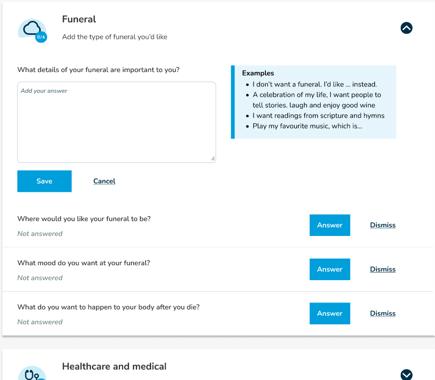
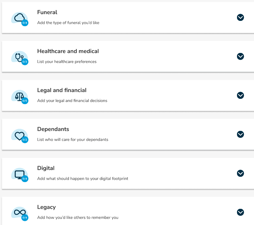
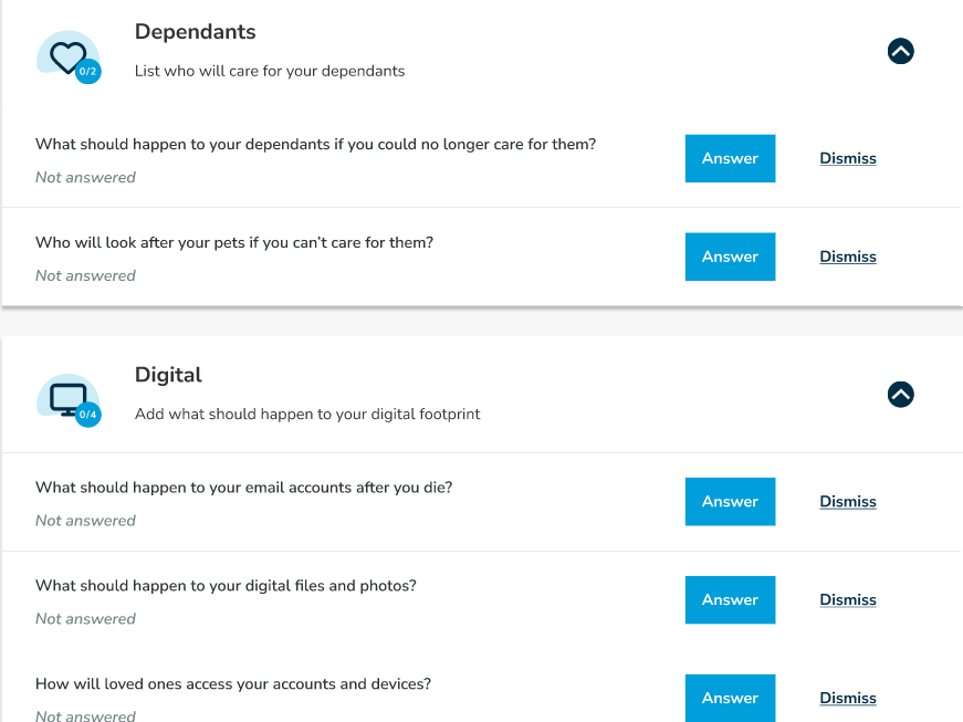
While we’ve prioritised the topic categories based on our research [estate and finances, healthcare, dependants, funeral plans ect.], we understand that end-of-life planning is highly personal, and priorities vary from person to person. What we were unable to include in this Maze is the questionnaire that will personalise the checklist for you and only show the categories you are interested in.
Regarding the user controls, we acknowledge there are limitations because the prototype is still in its early stages and there is a limited amount we can do with a clickable prototype.
As for the layout, could you kindly share which layout you found to be clunky? Is it the designs of the prototype itself or the maze software you used?
I would find it more amenable if in this case the ‘funeral’ section opened its own set of further line items so healthcare and medical did not show on the same screen, and a ‘back’ of some sort was required to get to
This is easy to replicate and IMO can confuse although I could understand others might prefer the ability to have everything in-line. A punt on which is better?
I was wondering why it asks for the camera and voice to be turned on?
Given it’s using a third party product, there was no privacy disclosure. Assume this would be integral with the final product, assuming some personal ID is connected to the preference profile produced by the tool.
Overall I found the menu relatively intuitive although I’d rate myself as a more digitally aware consumer. It was missing a RHS scroll bar on my PC when tested (Firefox). Something I’m accustomed to seeing and using. That may be a small thing that relates only to some users. Others would not even notice and intuitively use the screen controls in a different way.
The topics selected appear to cover all the areas I can relate to from recent experience (x3). Also some aspects I’d not considered.
A further note is the topics selected are short of what might be necessary for anyone with a small business or more than a few investment interests. Is there value in Choice suggesting a list of other aspects arising and relating to an estate that require more detailed advice. In particular financial dealings, ATO, ABN’s, ASIC, etc. Or has this been considered and Choice decided on where and how to draw a line? Noting some are inclined to share very little. The ATO can be very helpful - if a little slow to assist.
Sorry I can’t answer that. I have no idea which aspects of what I saw are intrinsic to the software and which were from your design decisions. I can’t think how I would ever know that unless I had studied the software before.
A general observation is that it lacks context and clear and flexible flow.
There is no introduction that explains either what is going to happen or what you will get out of it if you complete it.
Where will any data I enter be stored and will it be secure? What happens to it after I am done (in either sense of the word)?
Some text is quite mysterious, for example: where I am asked “Choose 3 words to describe the end-of-life planning tools you just used” it is labelled “Card sorting”. At that point I don’t know what a card is or why I would want to sort it, so what is the point of the label? Obviously the designer knows what cards are and what this means but to the naïve subject it just adds to the mystery.
Also I found it hard to test as I did not start from the same position in each session. In one case it started with a question asking to rate the prompts in “my wishes”. At that point I had no idea what that meant or why I was asked. This seems to be some kind of internal prototype evaluation that was intended to come at the end not the start. Visible diagnostics present in this version that will not be in the release with no identifying visual cue risk confusion.
Having stumbled to the end I now find I can’t get back to the start again or anywhere else. This makes it hard to test. If I had filled in data that I now wanted to revise, transfer or print it can’t be done.
@mguinea You are certainly on the right track. End of life planning is very complex and confusing. I am 79 yo and have done a will and lots of other things but it’s difficult to stay on top of all that. I also find it difficult to find someone to cater for all the EOL planning requirements: Solicitors for wills, accountants for financial matters etc. I reckon it’s a minefield and am looking forward to Choice’s new tool.
Cheers
I found similar with an iPad in portrait which eventually brought up an error. As the tool is in development and has limited capability, there is a possibility it is not able to function with your device/PC etc. If you would be happy to share the device/OS, browser and any add on protection EG AV that might be running. Others may have found the same.
I also turned off the option to video and sound record the trial session. I could not see why this would be necessary for the trial or for most users in a finished product.
Being a semi-regular alpha tester a few prototypes asked for videos, and one a think-aloud. The purpose is that watching the users reactions, seeking eye movements, and wandering mouse/finger actions is instructive to how quickly the person responds as well as whether they seem to have difficulty on ‘a page’.
Where the ones I enable have failed big time is there is no feedback that a video or audio is being recorded while it is being recorded, and no option to review it prior to an OK to use.
I would punt more than a few dollars that ‘feature’ is purely developmental.
An explanation that would be reassuring with the OP. With the support of a suitable privacy agreement specific to the trial including how the video etc would be managed, accessed and a timeline on deletion appropriate. @mguinea
The trial of the tool also requires a certain level of access to a system to use sound and camera. Something most devices and OS/browsers can provide. Although it assumes settings have not been set to block access. Mine are by default, with the exception of specific apps.
What is being tested is a proposed user interface to an application yet to be built.
It is done using a testing product called Maze. The idea is to record a person using the interface. Navigation, clicking, delay points, and yes, WTF moments where the interface just fails. A voice and or camera capture could be quite useful.
That capturing video and audio was an option and not mandatory encouraged my participation. That it might not have been as helpful as it could be? Something for Choice to consider for the future.