The number of Australians
receiving welfare has leapt by
425,000 people since 2018, with
a significant proportion on the
NDIS.
Institute of Public Affairs
deputy executive director
Daniel Wild said the growth in
the number of people receiving
welfare since the pandemic
was a concern.
“The rapid growth of welfare
dependency, often concentrated in certain geographic sections of the community, post Covid is an urgent wake-up call
to our political leaders that the
Australian culture of working
for a living is at risk,” he said.
The extracts are not from some unregulated blog but a mainstream newspaper, the Melbourne Herald-Sun, Sunday 7th April. Sorry about the formatting but I couldn’t get a clean copy. The article is based on a paper by the Institute of Public Affairs published 8th April. The headline is from the H-S but the quotes are from the IPA and its speakers.
Does anybody have any thoughts on about the numbers and the conclusion drawn from them as they are in the Herald-Sun?
Here is the IPA article. What do you think of its use of numbers to draw conclusions?
Isn’t it obvious? The welfare includes NDIS, which was only in early stages in 2018. Now in full rollout. That accounts for more than a part of the increase, it is pretty much all of it.
The tabloid headline no doubt would lead one to think that there are nearly half a million more dole bludgers and welfare cheats out there, when the reality is disability support now included. And it is very very expensive.
The conclusion of the IPA person quoted seems absurd given the data.
“The rapid growth of welfare dependency, often concentrated in certain geographic sections of the community, post Covid is an urgent wake-up call to our political leaders that the Australian culture of working for a living is at risk,”
I agree with @Gregr that the cited data do not support that conclusion.
About the IPA:
The IPA supports the free market of ideas, the free flow of capital, a limited and efficient government, evidence-based public policy, the rule of law, and representative democracy. Throughout human history, these ideas have proven themselves to be the most dynamic, liberating and exciting. Our researchers apply these ideas to the public policy questions which matter today.
Hmm … a report about apparent welfare growth, from a group with a preference for “limited and efficient” government, expressing concern about growth of numbers on welfare …
… when there hasn’t actually been any significant increase in the percentage of the population on welfare between 2013 and 2023.
The reduction 2013-2018 could be related to the fact that Australia acquired a conservative government in 2013, which in my opinion set about making it generally harder for people to get and stay on welfare, without trying to make it any easier for those who could work to find and keep jobs. I believe that the need for welfare was not actually reducing. Robodebt, introduced in 2016, could also have artificially forced a lot of people off welfare who actually do need support.
In the one chart that does show percentages, it’s clear there hasn’t been much change between 2013 and 2023. There’s certainly not a “rapid growth in welfare dependency” signalling that people no longer want to work for a living!
Any real increase can be explained by the introduction and growth of NDIS, as @Gregr points out.
Needing NDIS support isn’t a choice! It’s also not the same as being on JobSeeker or a pension.
NDIS support enables people to work if they can, when without the support they wouldn’t be able to do so. There are plenty of stories online about this if you need examples.
So NDIS is actually bringing a lot of people back into the workforce.
The reason for the spike during the pandemic is obvious.
The percentage was higher in 2021 than in 2019 because (a) a lot of jobs (and small businesses) disappeared during the pandemic, and didn’t suddenly reappear once the crisis had eased, and (b) there was a large number of people left with ongoing disability as a direct result of having had Covid-19, so an overall increase (from 2019) in numbers needing support.
And the trend from 2021 on has been consistently downwards.
Looking at Table 1, the data for Chart 1 and comparing the 2013 AUS percentages with 2023:
2013: 7.8%. 2023: 7.9%. Difference: +1%.
Difference between 2021 and 2022: 8.7%-8.2% = -5%.
Difference between 2022 and 2023: 8.2%-7.9% = -3%.
If that trend continues, the 2024 figure will be either the same as or lower than 2013.
There is no reason to repeat your work but I would like to add some detail to what you and Greg have said.
The IPA article
The paper is very misleading in many ways. There are two in particular that make drawing reasonable conclusions impossible.
Nowhere is the word “welfare” defined but a number of statistics are used to measure it and it is used in the conclusions. In collecting the numbers they make up their own definition, it comprises recipients of NDIS which is payment for costs associated with disability, not income support, plus some (but not all) government benefits that are income support. The notable absence is aged pensions. No explanation for this odd composition is given. It doesn’t accord with any kind of official statistics that I can find. Having no given meaning is an invitation for people to use it however they like and work it into their own narrative.
Besides being undefined the composite statistics called “welfare” produced by the IPA paper are simply wrong. You cannot add the numbers of those who get NDIS to those getting other benefits as the sets are not disjoint. It is quite legal for somebody to get income supplement payments, like a disability pension, as well as NDIS payments for disability services. The legislation was designed that way and tens of thousands of people have both. The IPA paper has created its own measure of welfare recipients and then inflated it by double counting.
The Herald-Sun article
The newspaper did nothing at all to verify the IPA data but simply regurgitated selected numbers and quotes from the authors and added their own headline. This is terrible journalism, you might expect to see them check with Social Services at least if half a million more recipients were created.
“Half a million extra on welfare” is absolute nonsense, especially when nobody says explicitly what they mean by it. In this context “welfare” is dog whistling for “dole bludger”. This explains why aged pension is excluded as the proponents see that as a government payment that they cannot attack.
The newspaper article was published the day before the IPA paper it is based on was. The most likely way for this to happen is they were given an advanced copy not that they looked into the future. It is pretty obvious that the Herald-Sun and the IPA have cooperated to produce and publish this material.
Both organisations are of a conservative bent, Isopeda has pointed out the tone of the IPA and its objectives and the H-S is Murdock press. On this occasion they have worked together to manufacture a dole bludger narrative and, without saying so directly, to put the boot into the present non-conservative government.
But wait! There’s more
On the IPA website sitting next to the subject paper is another titled “Fact Check Or Stacked Deck?”, it is another classic case of the misuse of numbers. It is an attack on any effort to fact check political statements. They do their own analysis of the fact checkers that they want to target and conclude that they hit conservative speakers much harder than progressive. Let us assume for the purpose of argument that is true, what do they make of it?
The IPA reason that there are only two possible explanations for their result - without giving any evidence that there are only two. One is that conservative speakers make more doubtful claims that need fact checking and the other is the fact checkers are biased and consequently conservatives are innocent. The data they assemble could be interpreted either way as they look only at outcomes that they classify not reasons behind those outcomes.
The IPA resolves the question very promptly like this:
The disproportionate focus on one side of these policy debates cannot be justified on the basis that only one side of the debate is making contentious claims or that only one side of the debate is prone to error. The only rational explanation for why just 62 of 703 claims investigated were targeted towards advocates of climate, Covid-19, and identity policies is ideological bias.
They give no reason for this conclusion at all, none, zip, read the paper (it is short) if you don’t believe me. This is called Begging the Question, a fallacy where you assume your conclusion in order to prove it, the collected statistics are but window dressing to give the result more truthiness.
Given all of the above it seems fairly clear to me why the IPA at least does not want to be officially fact checked.
I read anything from such sources as I might material from the world famous Ponds Institute. It exists purely to assist the business that sponsors it to promote their products.
One can faithfully believe in the mantra and overlook the failings of the many expensive skin beauty products. Aligning self belief and a product which appeals to one’s needs makes a powerful marketing tool. Whether one believes in the 4P’s or the 7P’s of marketing, there is always an institute somewhere to guide one. Institute of Personal Care Science.
I did find some solace with The Conversation article. In true Choice mode the many graphics demonstrated line and bar charts can come in multiple colours. Whether it makes the data a more desirable product, alas Dianna Fisher is not able to assist with a reasoned assessment.
At what point are such articles really an “Advertorial”? It’s a fine line what ever the product - irrespective of the quality or lack there off of the content.
I think the final sentence says it all about fact checkers.
"Given their demonstrable bias over a significant period of time, there should be no role for these organisations in arbitrating what is or is not ‘true’ on the internet. "
So fact checkers are very inconvenient to the likes of the various publishers of blatant disinformation and misinformation because most of the time their “facts” are demonstrated to be false.
The IPA is stacked with climate change and other denialists, and it not hard to see where the conservative side of politics gets its ideas and reports.
It’s all just marketing.
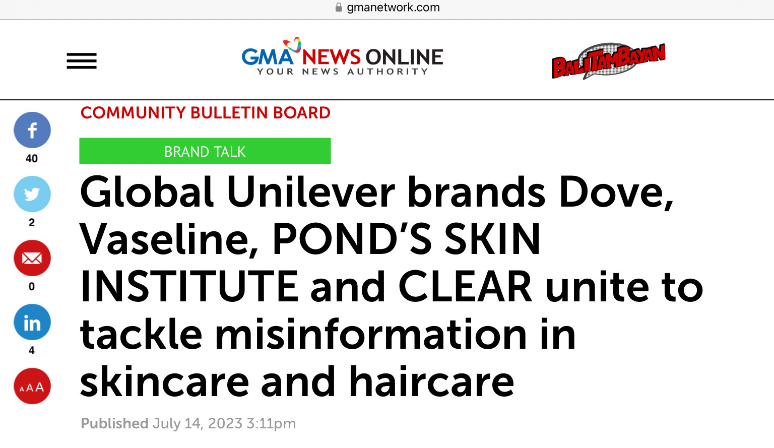
Look at the following. Is it news or is it something else? Headline and one extract that is intent on using numbers to add credibility to the news worthy event.
The answer is at the bottom on the news item. Most consumers would not need to follow the full article to decide on the provenance and hence reliability or BS factor of the content. For those who believe in the values of beauty and in beauty products one response. For all others a wasted headline.
The headline is a waste of space in my opinion, it is Unilever providing the propaganda, the owned brands “uniting” already occurred when the parent company united them long long ago.
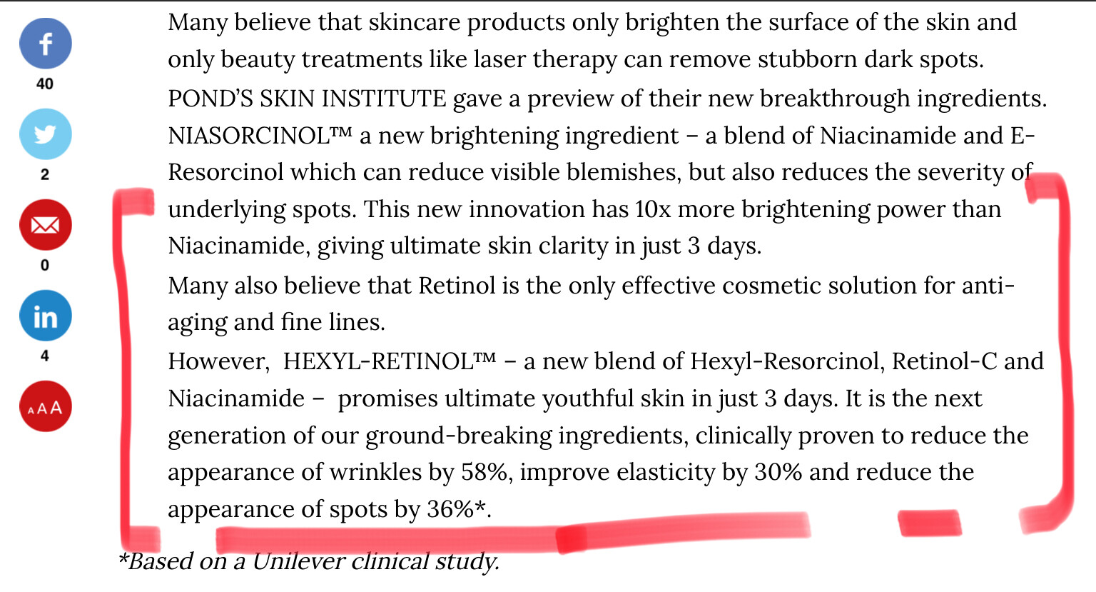
It is using statistics, 10% and 3 days among other figures are mentioned and to get this they use statistics. Whether it is puffery or not is not really able to be tested as it is just provided as a figure with no posting of the results that led to such a figure. They do provide an asterisk to link to a study I am guessing, though nothing other than the results are directly shown in the piece. Retinols certainly work on skin to reduce the appearance of marks and so on. The further one gets away from retinoic acid the less effective the compound usually becomes. Most retinols rely on the eventual conversion to retinoic acid, this acid is then what acts to ‘clarify’ the appearance.
Unless we can say the statistics used are unreliable or used in an inappropriate way in order to mislead this is just normal advertising.
The fact they use numbers to support their sales in itself does not make it a case of misleading by statistics as the numbers may be accurate and useful.
There is a reliance that people will not seek further clarity. The results provide the basis for the advertising, and as I noted that may be or may not be the use of puffery. Visiting Unilever’s sites offers not much more than, I believe are, puff pieces. I did manage to find one reference that had the numbers tested in the trials and that was 40 women. I wonder if the results are self reported benefits by the participants (at times an unreliable gathering of evidence). Any scientific papers I could find linked by them on their sites did not show any of the trials conducted for these advertised products. One naturally occurring product (vitamin) Nicotinamide is certainly known for it’s effects on skin and has been used for quite some time to help reduce UV damaged skin lesions such as keratoses.