Has anyone else noticed changes in the display of unit prices on the shelf labels in some Aldi stores, and if so what do you think about them?
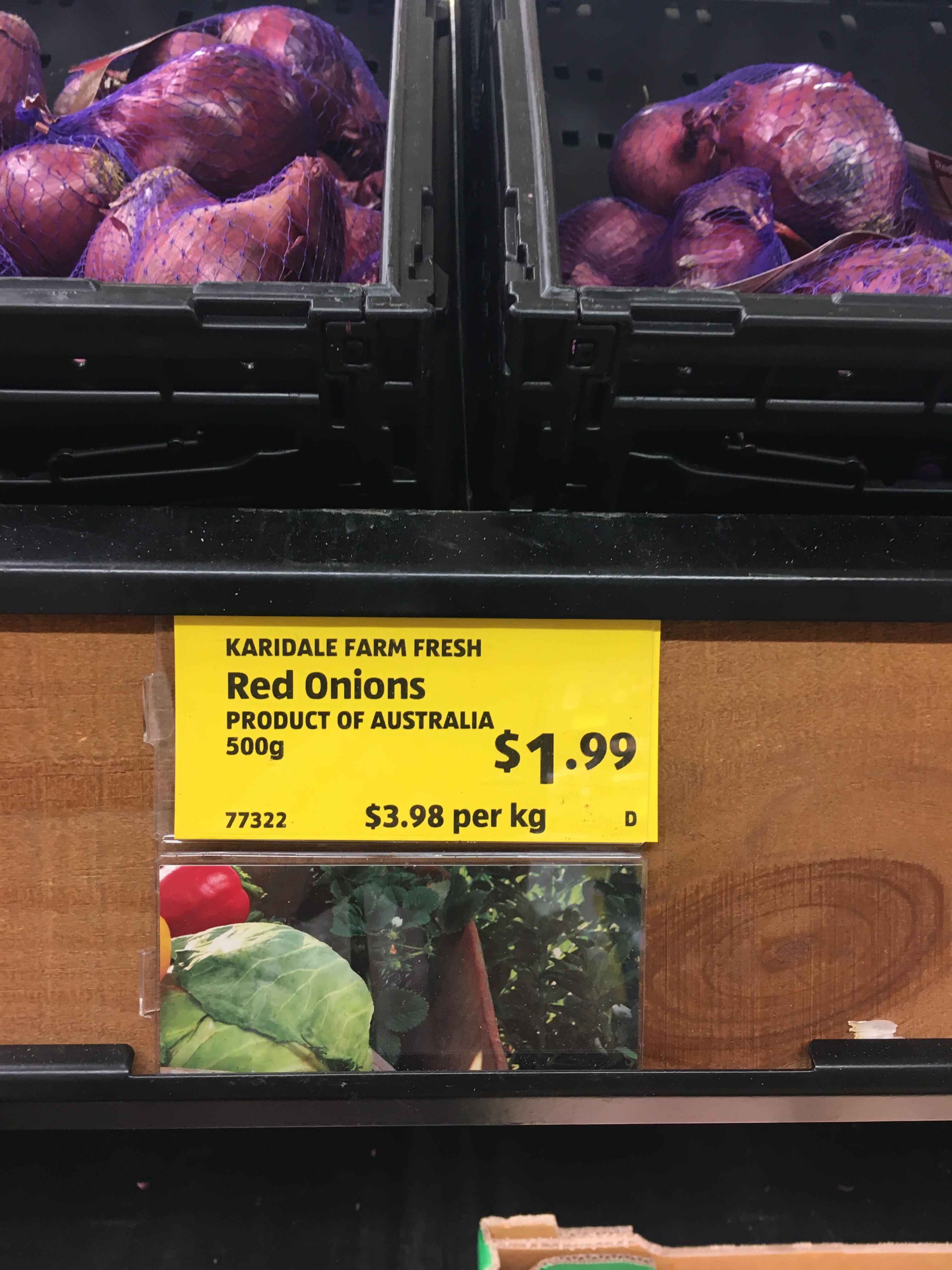
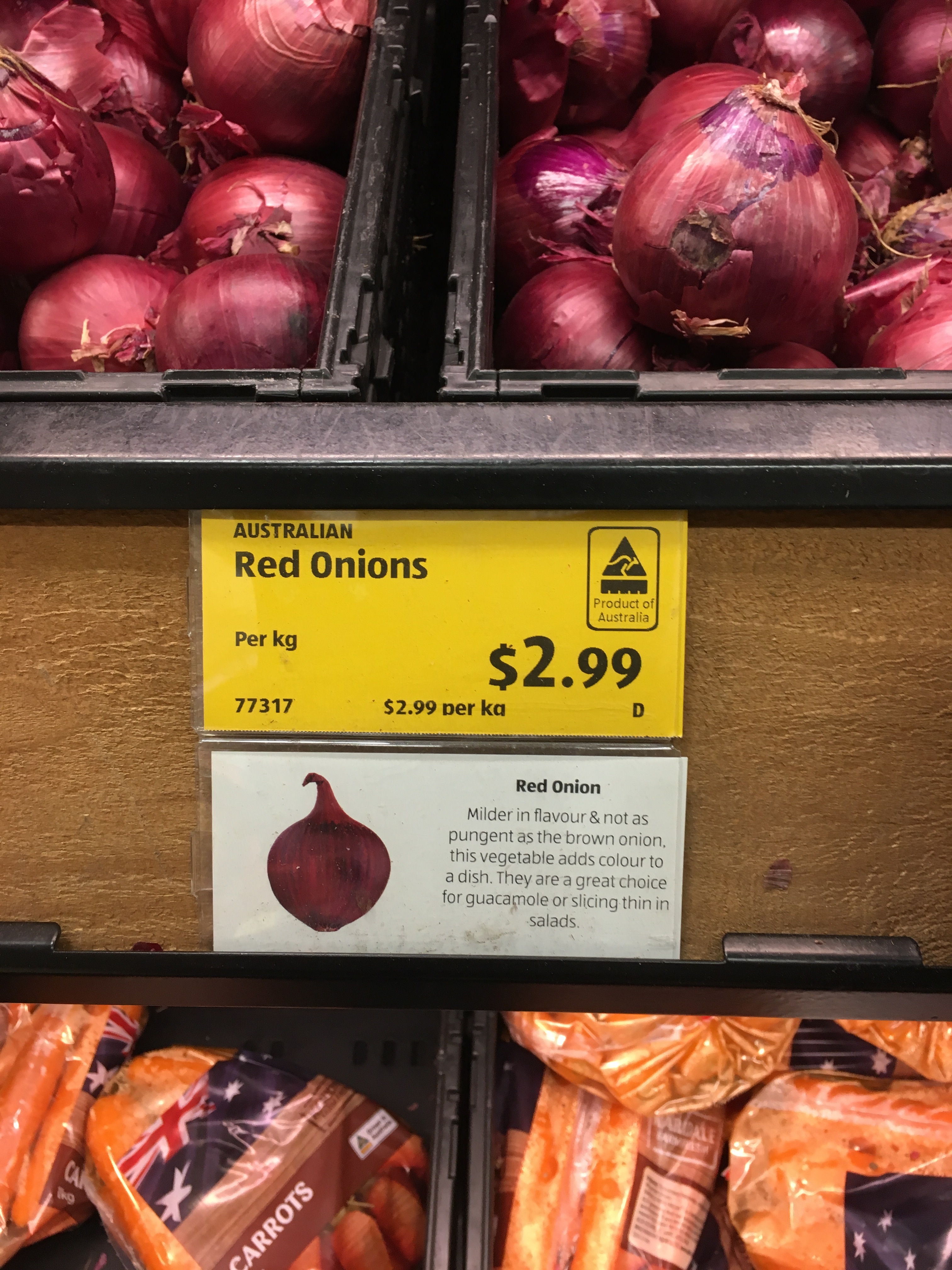
The first change I noticed in one store was the greatly reduced size of the unit price on new labels (incorporating a kangaroo logo) for products made or grown in Australia. Photos of the old and new labels are below.
My complaint to Aldi resulted in an unhelpful generic response.
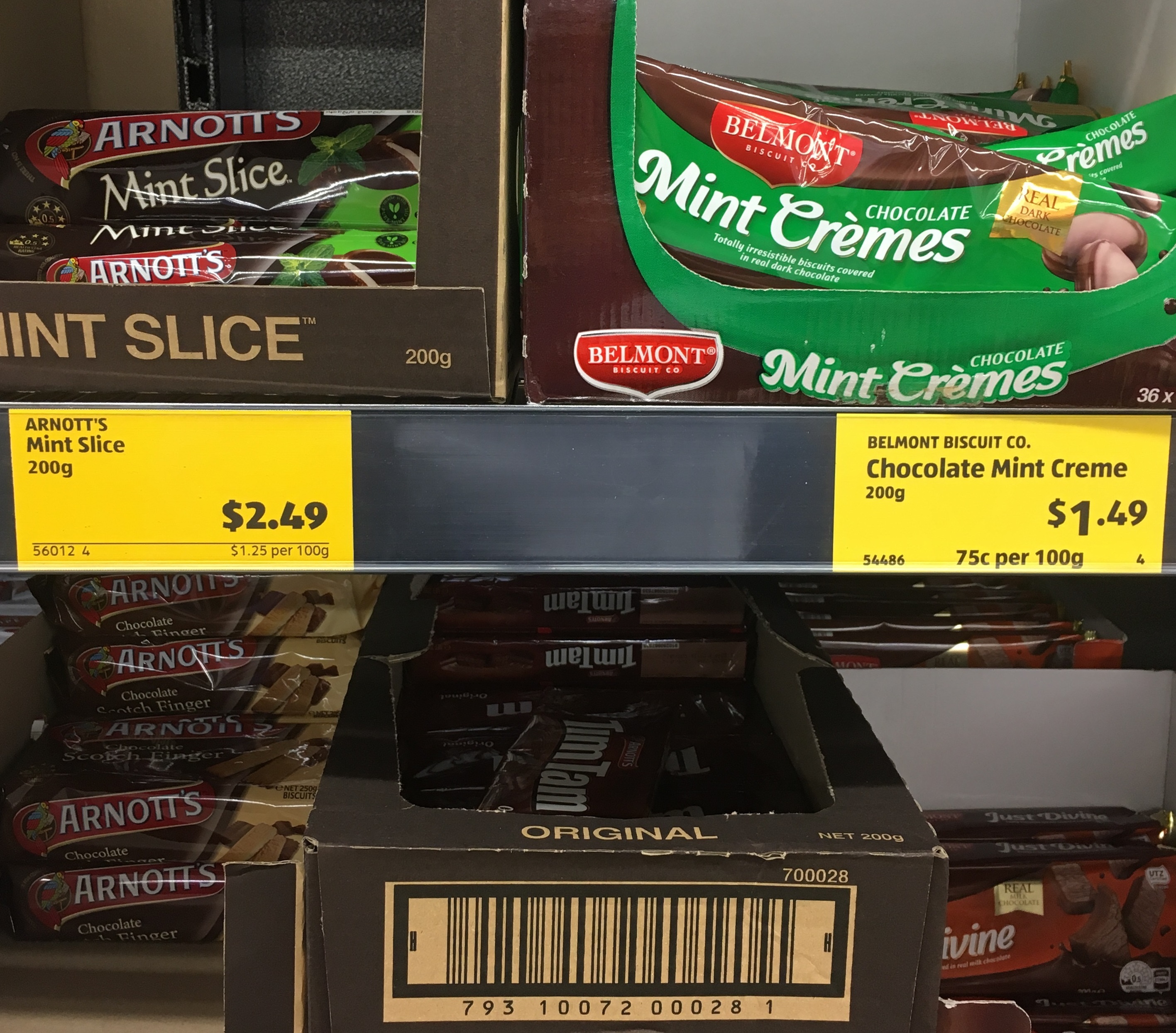
The second change I noticed was on some general shelf labels and in this case the print was even smaller and also not bold. A photo of the new (left) and old (right) labels is below.
I think that both changes greatly reduce the prominence and legibility of the unit price (especially when the label is not at eye level) and that there is plenty of room on the labels to make the unit price really prominent and easy to to read. Any comments?
Good thread and great evidence of playing games. The US version |I honestly think is the way to go for legibility. As for ankle height pricing that needs to be looked ast also.
Yes, I agree that the example of a type of shelf label used in parts of the USA (with the unit price in very large print, on a special coloured background, and also showing the words “unit price”) I posted previously, has many advantages for consumers.
However, there is also great scope to make less radical changes to providing unit prices on current shelf labels that would be of great benefit to consumer and enhance consumer satisfaction with, and increase confidence and trust in, the retailer .
Having programmed and edited shelf label reports the amount of room is often extremely limited. (you have to accommodate ‘worst case’ scenario’s of field sizes to some degree). Also may be fields present that a store/chain doesn’t show/use but as you don’t want a bajillion variations to maintain POS providers may just have options of what to display etc.
Looking at the example it wouldn’t shock me to see a product description potentially wrap on the old image and thus bump the PLU code and unit price of that label (or it would crop and cut off … someone probably complained about that) and possibly ruin the rest of that run of labels that printed (could be multiple sheets). It already looks like its margin challenged (ie in the red onions case you can see the ‘g’ for ‘kg’ has the bottom cut off.
I don’t particularly like the design of the ‘new’ one and wouldn’t have chosen to do it that way but the stores probably can’t control what they get and likely even ALDI Australia might be just overall stuck with whatever the global franchise comes up with. I bet you there were more than few people that really really like the aesthetic of the new label and were probably not considering unit pricing even remotely a thing.
Thanks for the the interesting comments about what is involved in displaying information on shelf labels.
I appreciate the difficulties, especially with small labels.
However, I suspect that your comment
may be very perceptive. Which is a pity because, quite apart from the legislative requirements that the unit price must be prominent and legible (and not only at eye level) if retailers do a good job with the provision and display of unit prices this increases customer satisfaction, trust and confidence.
This is where the customer comes in though :). If you are shopping somewhere and like the way a store does something, take the time to put it in writing and let them know they are doing something that encourages you to shop there. Same goes for the opposite as well of course.
I can tell you from a working lifetime spent in the retail and hospitality management sectors, I would struggle to fill a 48 page exercise book with customers making compliments when they are happy about things. I wouldn’t have room in my house to fit the negative comments when something upsets them though lol.
A store is a business and when they are run by sane people, they are normally not in it to lose money. If they are alerted in a non-toxic way that customers are unhappy with something, with enough voices that usually changes. However the same situation applies with things a customer is happy with. If you don’t inform a store that you like how something is done, how can you be upset when they change it?
I agree that more consumers should give positive and negative feedback to businesses. I do that often.
And, as I said in my post, I complained to Aldi about the unit prices on the new labels with the country of origin kangaroo logo and got an unhelpful generic response.
However, businesses also need to do their own research into likely consumer impacts of possible changes to business practices, including to labeling, and not just wait for or rely on consumer feedback.
I personally don’t see a problem with ALDI labels on the shelf. It is still readable and no big difference to other major shops such as Woolworth and Coles.
I suspect business does significant research into what is important to them, P/L. That is the world of margins, ranges, volume, floor space, wages, and pricing, not price tags. The impact of price tags on a consumer is only interesting to that set of equations if when it affects the bottom line, otherwise why would they make the investment in researching?
My guess is their research shows that making unit pricing obvious, consistent, and relevant, is an attack on their higher margin lines, not considered because it is a consumer benefit. Therein lies a top reason for your good work; they will not do it if they do not have to, and they will do it to the least extent required when left to themselves.
The print Aldi is using for the unit price on these new labels is much smaller than that used by Coles and Woolworths and is no longer bold.
Until now, the print used by Aldi to show the unit price on the shelf labels for regular priced products has been much bigger than that used by Coles and Woolworths.
Also, as mentioned by me and a previous contributor, photos of labels with unit prices looked at online tend to make them seem easier to notice and read than they are in practice, and especially when the labels are further away and the viewing angle is more acute.
Unfortunately, we do not know enough about the impacts of effective unit pricing on retailers. However, some research suggests consumers have a more favourable view of the retailer if unit prices are provided consistently i.e.using only one unit of measure to unit price all items of the same type of product.
I would agree as a matter of research reinforcing common sense
and specifically their P/L, which is the point and their focus.
There are a number of local businesses I have a very favourable view of, but for other reasons (convenience, price, ranges, etc) that does not translate into my custom.
In your capacity you might try recruiting a PhD candidate (statistics or marketing focus) to see if there is a demonstrable relationship. For completeness it would correlate unit price displays with propensity to preference the shop not just have a favourable opinion of the shop, and include impacts of price, range, shop look & feel (subjective, but), and so on. You can see where I am going; I would think any scientifically based research and analysis would have to be useful pro or con.
I have persuaded several academics here and overseas to do research on various aspects of unit pricing, such as the situations in which consumers use unit prices, how they use them, and the influence of different units of measure and qualities of display on consumer behaviour. However, unfortunately, I am not aware of any recent research on the impacts on retailer returns. That probably reflects the likely difficulty in getting reliable data.
One study, that I think is very interesting and relevant, found that when provided with the unit prices for the first time many consumers did not changed to buying the lowest unit priced items of a product. Some made no change. As I have done myself, some bought higher unit priced items…
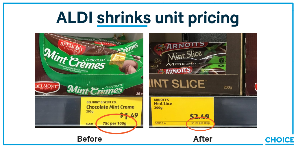
I look at the Arnotts Mint (Low visibile Unit) vs Aldi Mint (High Visible Unit)
I would not be surprised if that was deliberate , I wouldn’t know the exact reason,
Do they make a higher profit margin on the Arnotts?
thus want to discourage a buyer to compare the two products
Maybe they make a higher profit on ALDI brand thus do the anti competitive; more prominence to the unit value of their product.
Maybe they are also doing an internal study of the impact of unit price prominence changing one label of like for like in each category
I think it was just a accidental that the unit price was less visible for the Arnotts product. However, I’ll check some other labels when I’m next in the store and will let you know if it seems that labels are being replaced selectively.
CHOICE has started a campaign on Aldi’s recent changes to unit pricing visibility. Join us and tell them to make tags clear and easy to read: https://goo.gl/zrUc78
*And, while you’re at it, do the same with the labels you use to draw attention to some products, such as supersavers and price reductions. The unit prices displayed on these labels are also not easy enough to notice and read."
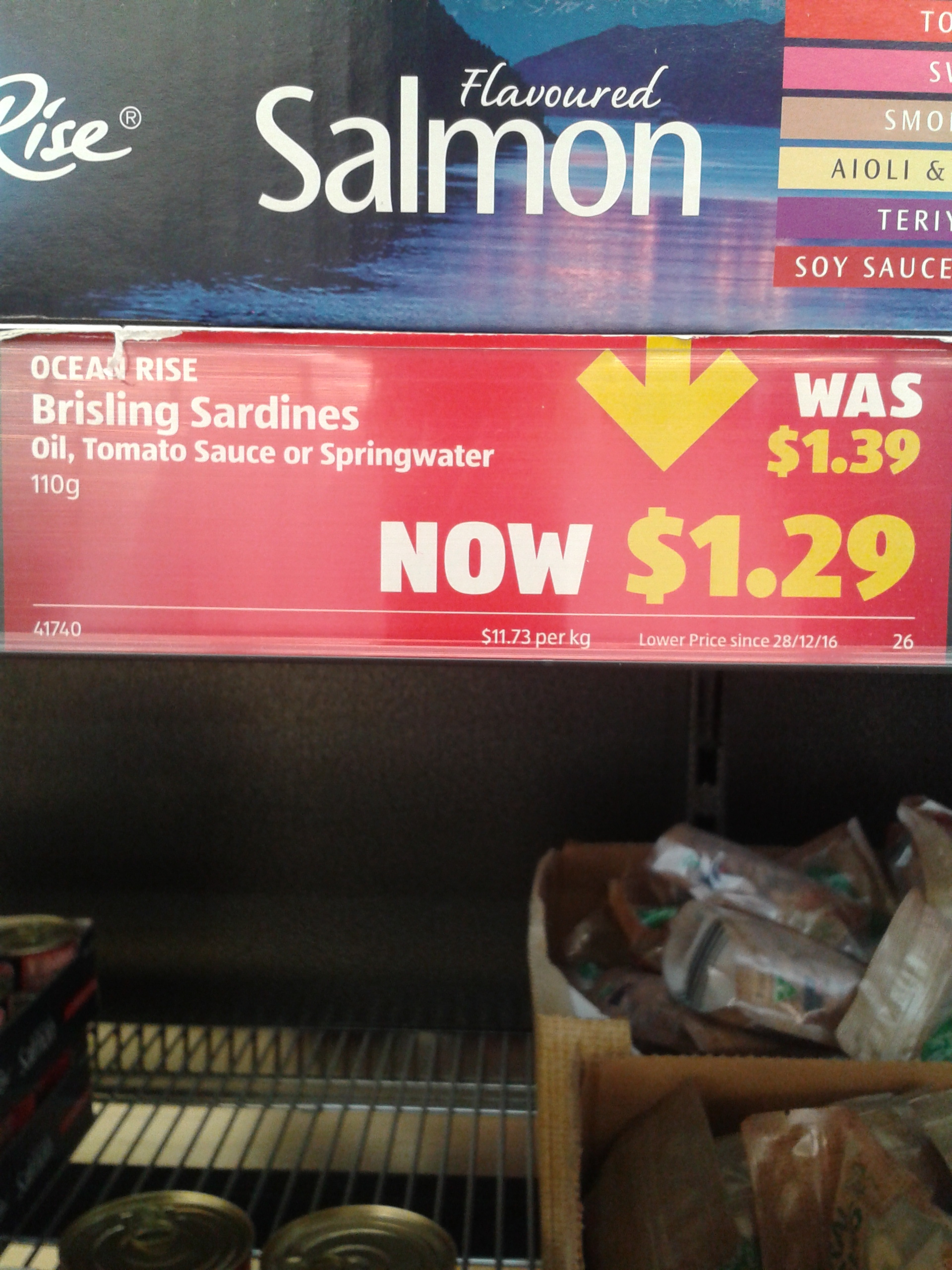
Here is a photo of one of these types of shelf labels.