Hey @BrendanMays (you normally answer these, so I’ll assume it goes to you).
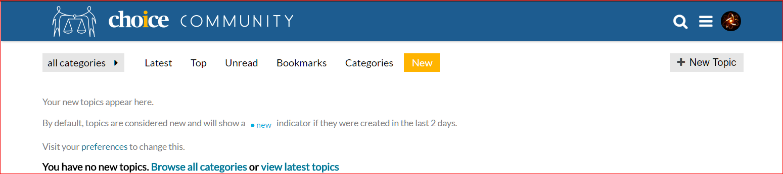
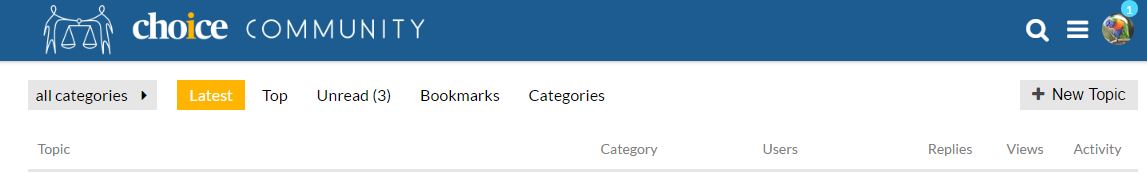
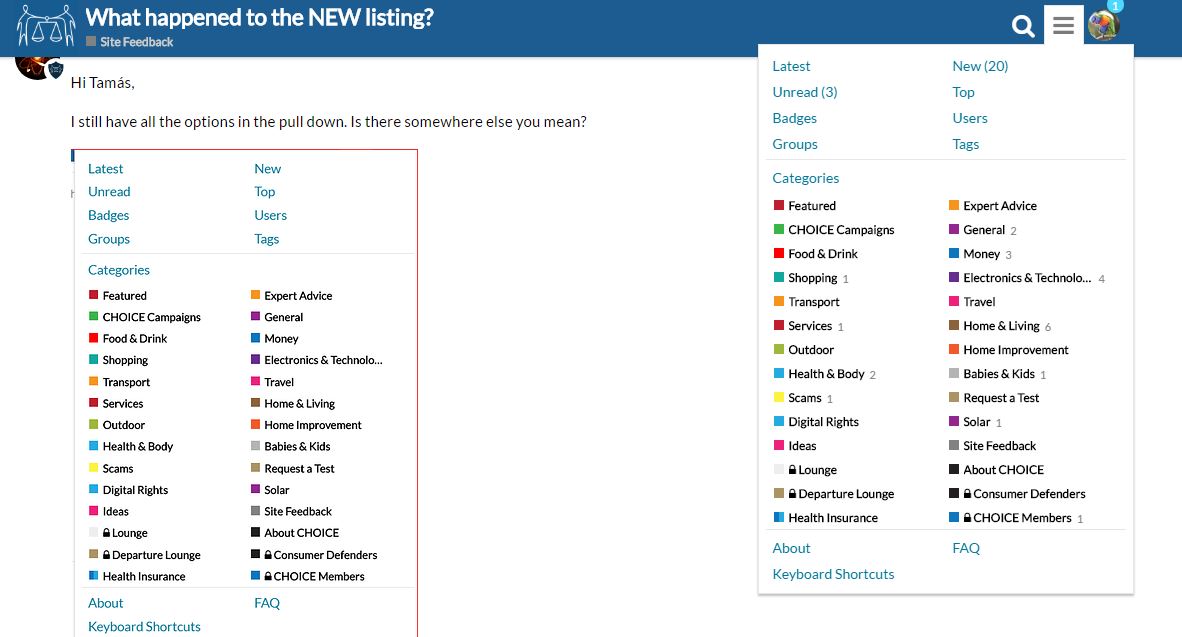
A couple of iterations ago the Community site had a top level heading for NEW topics. That disappeared. I now have to scroll down the sometimes several refreshes of the page to find NEW next a topic(s).
To me NEW is a brand new topic. LATEST is the latest comments on existing topics, regardless of the topic’s age. I would like the option to select which I want to see This way I can see if something new interests me, before getting into existing topics.
@meltam - I received a few emails in the early days of the forum expressing some confusion from some users about the new/latest thing, so we decided to put it into the current format. However, we’re always open to suggestion, and one possible solution would be to make this customisable according to user preference. I’lll discuss this with our developers, but in the meantime hopefully the drop down menu will save some time.
@PhilT - Interesting that you still have ‘New’ on your menu, that is indeed outside of the plan. Do you mind confirming your browser so we can explore further?
Perhaps the people who emailed you in the early days were novices? To obviate confusion, perhaps if there is an “i” (information) hover-over drop-down that explains the difference?
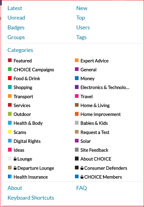
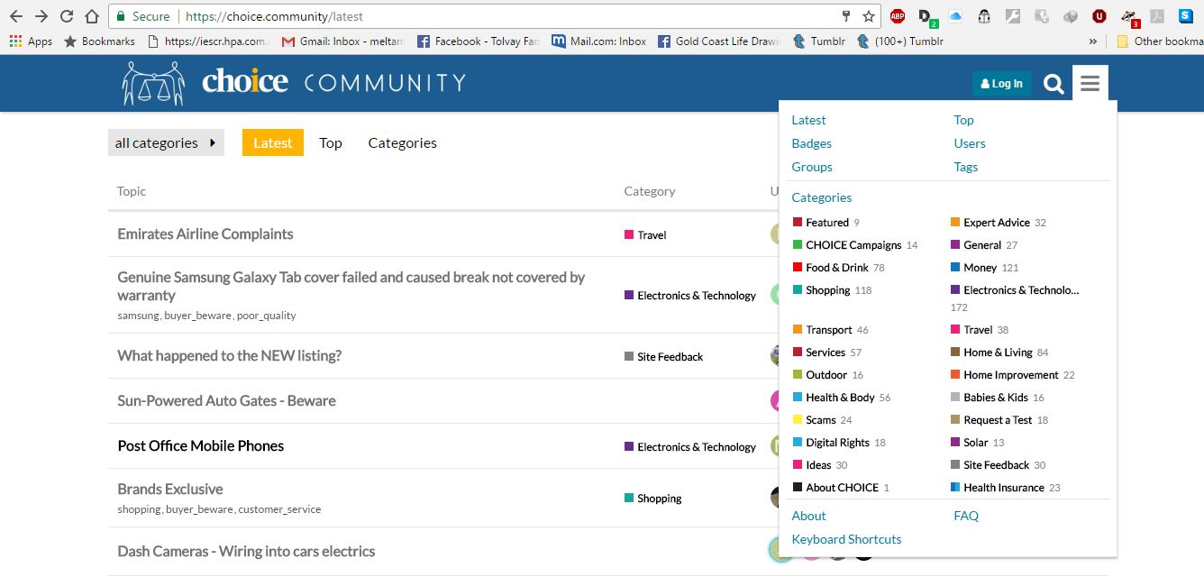
Firefox, Opera, Chrome, and IE11 all have New in the pulldown - I stay logged in. Looking at exactly what I did I realise that New does not show across the “Menu” until I select it from the pulldown and when I go to any other mode (eg latest, etc) New is gone again. Thus it is not a selectable element, just a header to show “where” one is.