Looking at my first review for a while I was disappointed to find that the report on hummus which I viewed on my computer seems to be formatted solely for phone. Comparing six products now presents a narrow table in huge text which therefore only displays 4 items side by side. So you can’t really compare six items at all, or there’s a lot of unnecessary side to side scrolling together with additional up and down scrolling.
Can Choice please provide a presentation suitable for desktops, notebooks and tablets again?
2 Likes
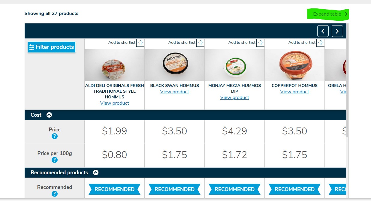
Click ‘Expand Table’ as highlighted in this snip
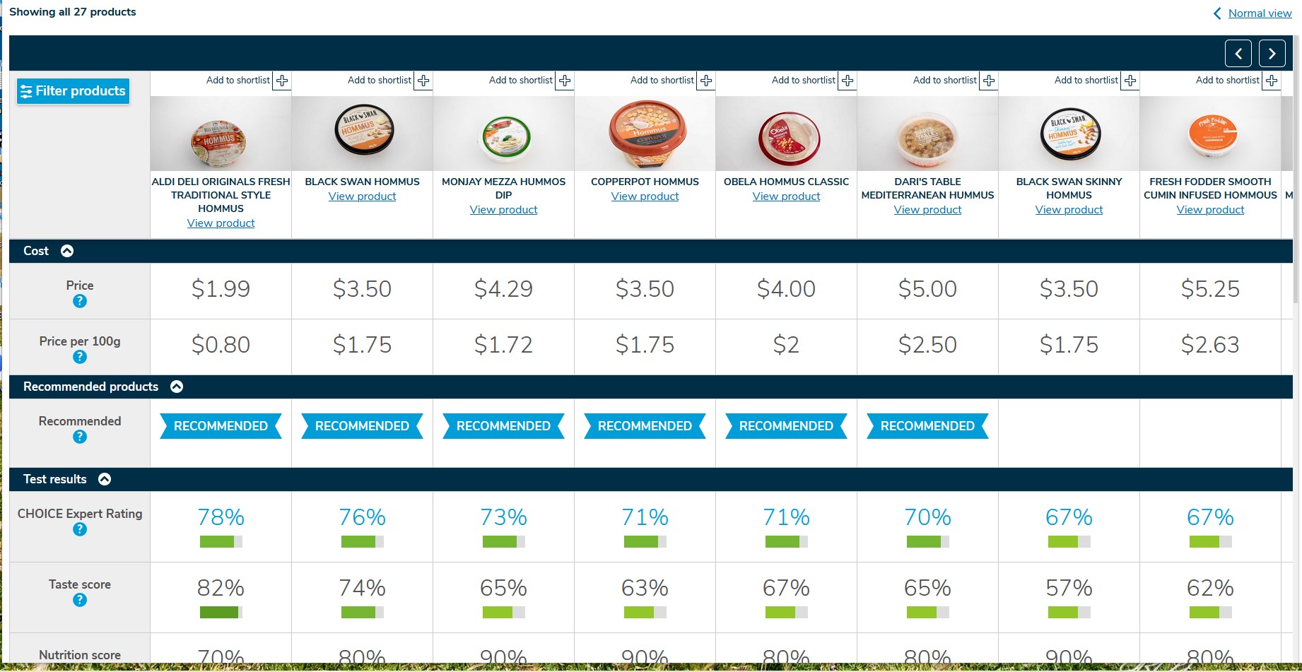
Result is
Hope that helps, if using some browsers you can also use the Ctrl key and the - sign to decrease the zoom on the page thus increasing the number of items you can see, once finished to get back to a normal zoom use the Ctrl and the + key to re-enlarge your image.
3 Likes
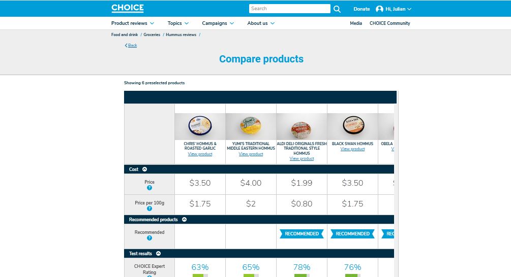
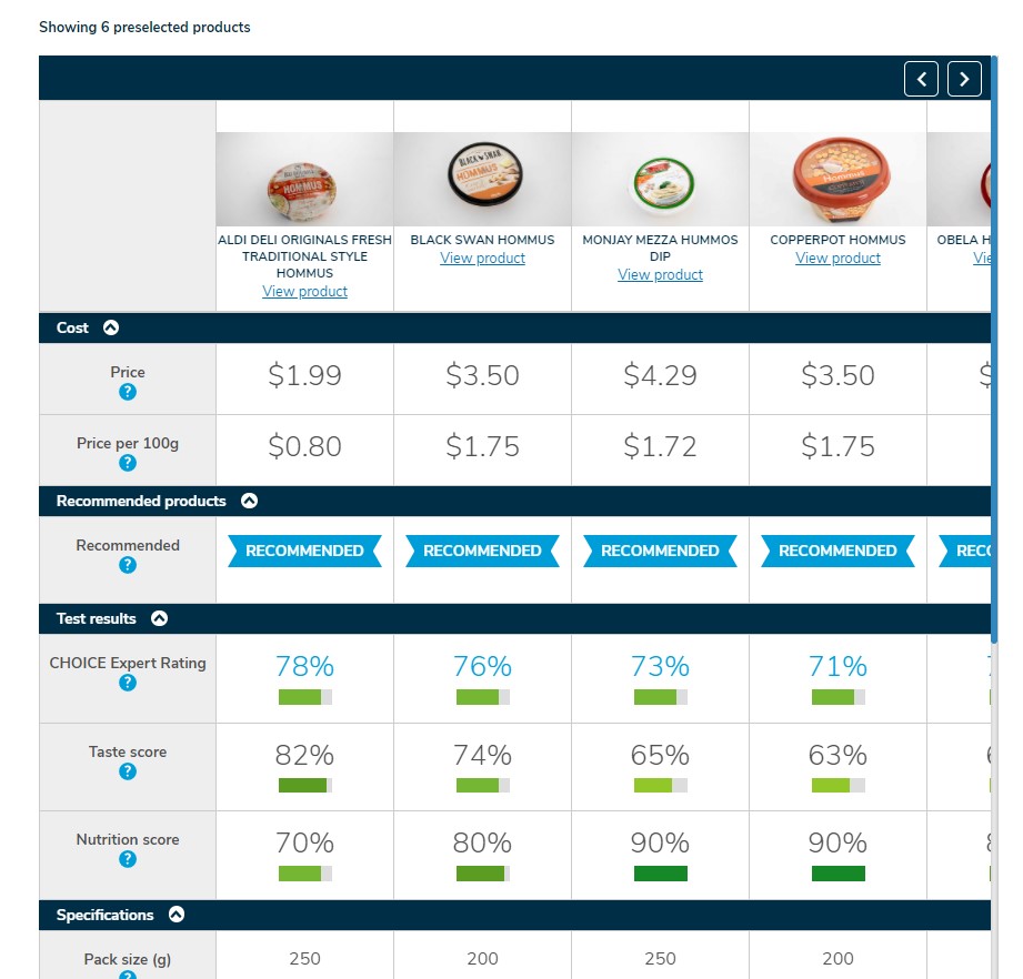
Thanks. I understand how to zoom and that you can expand the Show All. I was referring to Compare Products aka Compare Details screen where you can choose up to six items to compare. As mentioned only four fit on the reduced width screen at a time. Zooming out just shows a smaller version of the same four columns, you can’t see your 6 products at one time hence horizontal scrolling required. It appears to have been designed for a phone.
2 Likes
I am limited to 4 choices to compare in a shortlist, the selection symbol disappears after 4 are selected from the compare all page. I cannot thus select 6 at all. With the 4 displayed the only scroll bar presented is the up and down. Are others only able to have a maximum selection of 4? This is on a PC for reference.
Ahh I now understand, these are the Compare selections from the Review Page, it does look like a formatting error on the preselected items page, I think this may not be a designed outcome but may be some coding issue. Thank you for reporting it. On my screen it only presents two at a time and not even a full two at that, snip is from the page in Firefox.
On Opera it is 4 1/2
On Edge again 4 1/2
If moving the mouse pointer around when moved over the table the focus is shifted back to the table, causing the page to center on the selections, making page navigation somewhat painful.
Tested page layout and mouse focus on Induction Cooktop Reviews with the same outcomes as for the Hummus Review so I am assuming a site wide issue.
Attention @BrendanMays @jhook @jzarate
PS Sorry for the captured member content but was hard to show the problem without the added details. Remove as required as only provided for page problem purposes.
2 Likes
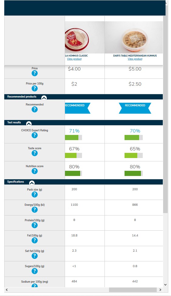
I can select six, but only four are visible without scrolling to the right. I can also ‘select all’, and that too requires scrolling horizontally.
I think that the issue starts with the window within which selections are show; it only utilises the middle two thirds of the screen at best.
2 Likes
From the Compare All page there is a choice to select some to compare but the selection on that page seems limited to 4 (at the top right of each item there is a + symbol to choose the ones to compare).
2 Likes
Yes, I too am limited to four in the compare all page vs six on the initial listing.
2 Likes