I suggest a rethink in the entire banner layout to make it flatter and less intrusive. Simple things can be thought about such as why there needs to be two ‘Choice Community’ headers, one in the blue band and the other much larger with the full logo. How many visitors to this site would not make the connection to Choice? Probably at least one, but.
Bottom line is my vote is the banner is still far to large. I am using a PC/Firefox.
Thanks for the feedback @PhilT. In an ideal situation we’d allow for maximum customisation so that people could hide or remove the banner if they chose, so this could be something for future consideration.
Based on our site analytics, the large majority of visitors to the forum are coming organically via Google. Our thinking was to improve the experience for incoming readers and to make the connection a bit more obvious. It’s a credit to the high-quality discussions that often happen here in the Community that we are attracting this type of interest. However, we also want solutions that make sure the forum is comfortable and easy to operate, especially for those using it regularly.
We appreciate the ongoing feedback for those reading this thread, so pleasel continue to share your thoughts - whether you love the format, hate it or are indifferent.
Like hem lines going up and down, in three years a switch back to the previous colours will be hailed as fresher and more modern. You cannot allow users to forget about the interface and to concentrate on content and activity because if it remains static too long they will think that you are not doing anything. Where is the fun in software rolling over to care and maintenance if there is none?
Looks good . Maybe instead of having to mouse over the "hamburger " to bring up the message "go to another topic list of categories " you could have some drop down tabs which are marked for these functions . /
Not everyone using the site for the first time would be aware of the burger being the key to our literary efforts and categories containing same ./
I’m still having nightmares about the first time I used the PayPal site . Hmm same colour scheme too .
A fair question methinks is whether that that is in the same internal discussion as sorting the categories in the hamburger menu, and other suggestions that have been ‘taken on board’ over time?
It seems the IT folks could be reluctant to change anything from vanilla Discourse, and if that is the case I understand why, but if it is the case it would be kind of you to be clear about that to minimise our expectations.
Thanks for the question, I’m happy to answer as best I can It is indeed covered in the same internal discussions, we are always very keen to hear from people who interact with our communications, campaigns and of course the discussions from our valued Community members.
Using the example of the hamburger menu, we have received the above suggestion of a potential improvement. We also take into consideration earlier comments where people seem to like the Discourse platform, and I think that the sentiment in the past about the software has been mostly positive? We will also consider emails, comments from external parties that come across the forum, advice from our internal UX team, digital developers and more.
As we’re taking this on board and discussing improvements, we’ll consider the resources required, the potential risks or detriment to making the changes (or not making them), our existing priorities and we also need to factor in changes that are occuring at a top level in the organisation such as branding changes or how other teams are going about their strategic goals. We’re also always looking to implement the best functionality on an accessibility level so another quesiton is to include a view to look at things from that perspective.
With those points in mind, we then have a multitude of factors that contribute to what we can implement and when. Some suggestions we can implement more easily. Sometimes changes occur in line with what’s happening at an organisational level, such as if we update the styling or design of other areas at CHOICE. We may need to consider technical factors - how would a change to our menu system effect mobile device users, for example. If it’s a benefit to both mobile and desktop, does this shift our priorities? These are the type of things we talk about and more when a suggestion is made.
As a member based organisation, it’s very important that we have an open dialogue with our members and supporters, and more broadly all Australian consumers. Looking at things from the inside, it’s great to be a part of such a unique place that allows us tp devote considerable time to things that other operations simply could not manage. Having said that, if there is an instance where we have failed to meet expectations (and I know there are suggestions that we have not yet addressed) or there is anything else we could look to improve, please continue the discussion either here, in a direct message or via email - you can get me direct at bmays@choice.com.au.
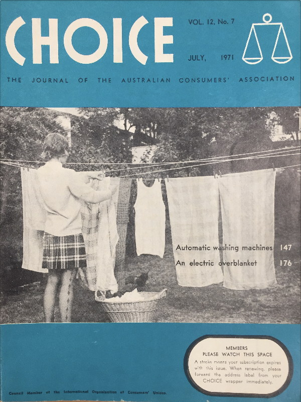
Thanks again for the feedback. Regarding an older comment about the imagery inside the circle, it is from some of the early editions of ‘CHOICE - The Journal of Australian Consumers’ Association’. Here is a picture of a 1971 magazine cover image if you are interested, where you can see the scales of justice image top right, signifying working for a fair, safe and just market for all consumers.
I know there was discussion previously about this, and I don’t know if this is deliberate, or because of the migration to the new server and new version of discourse.
May I suggest that it is needs to be reduced in size significantly so it doesn’t seem so much like a smack in the face with a wet fish.
Those of us on the reading side agree it is ridiculously large and overbearing, a little over a month old. You might not take comfort at Choice’s response but they did respond, sort of.


 It is indeed covered in the same internal discussions, we are always very keen to hear from people who interact with our communications, campaigns and of course the discussions from our valued Community members.