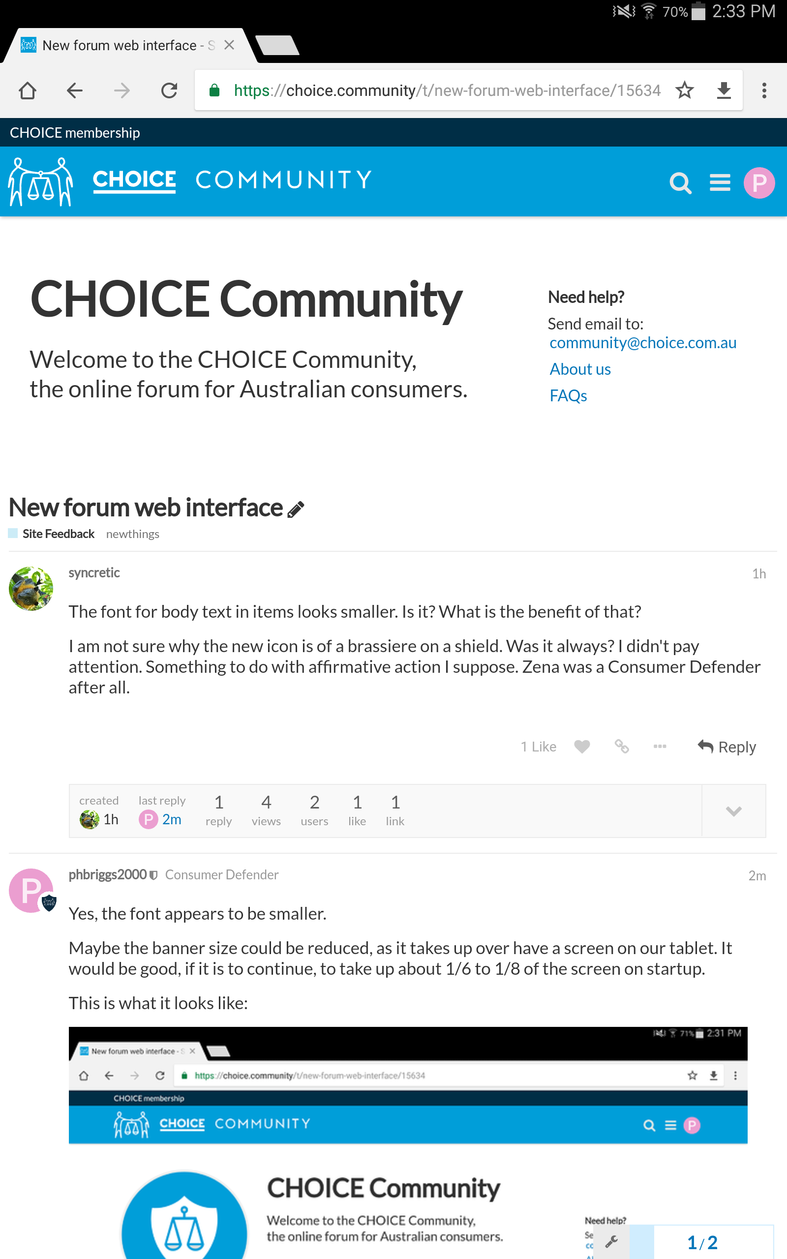
The font for body text in items looks smaller. Is it? What is the benefit of that?
I am not sure why the new icon is of a brassiere on a shield. Was it always? I didn’t pay attention. Something to do with affirmative action I suppose. Zena was a Consumer Defender after all.
Maybe the banner size could be reduced, as it takes up over have a screen on our tablet (landscape mode). It would be good, if it is to continue, to take up about 1/6 to 1/8 of the screen on startup.
Thanks for the feedback all. We’re working on the font issue, and we can consider reducing the banner size if people are finding it too intrusive.
We’ve used the scales on the shield before in the Community before and wanted to bring it to the fore, but we can also change this if we find people don’t like it, so please add your thoughts here.
The only other comment is the viewed links on the front page have a similar shading to the unviewed links, making it difficult ti dtermine which threads one has recently read (or has not been updated with a new post).
Is it possible for the grey colour to be more contrasting (like before whete it was bolded black and medium grey) or two different colours used (say black for unread and blue fir read?).
The myriad basic issues with the website suggests Choice should reflect on its design, review, and QA process. From my perspective it shows a lack of process and reference to best practices while has been inspired by whatever the responsible people think might be trendy. Perhaps a harsh criticism, but.
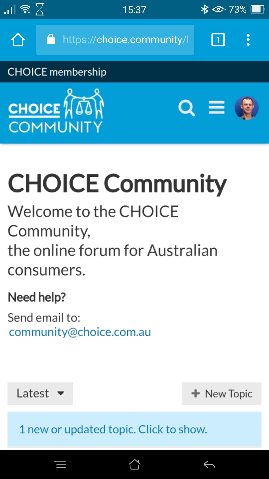
The above is a screen grab, except for the browser tabs at the top where my first line of text appears. So as you can see, it dominates the page. This is more than bringing it to the fore - it is WAY TOO BIG!!
Thank you for the details regarding how viewed links are displayed. We are currently working on applying a better distinction between viewed and not viewed and will let you know once that is complete.
The un-viewed posts are now displayed in Bold, and the viewed posts are a Regular font weight and medium grey. Hope that has helped to get it back to how it was? Thanks once more for your feedback.
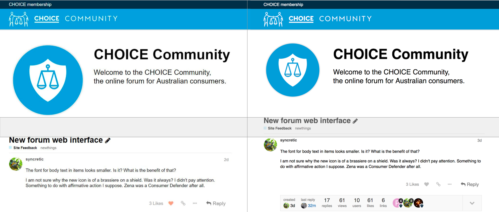
We have reduced the height of the banner by 70px now (before and after image is attached).
The banner will still display on tablets. Your Samsung 8.4 inch will still show the banner without the image as we would like to keep the links for FAQs and help if needed prominent, as well as distinguish the CHOICE Community from the choice.com.au website now that the main colours are the same. I hope that isn’t too intrusive. Please let us know if so and thank you for the screenshots.