Coles seems to be progressively changing the display of information on the large and small shelf labels it uses for regular prices in supermarkets. Photos are below.
I think the unit prices are more difficult to notice and read, especially on the lower shelves.
I’d interested in what you think, especially after you have looked at the new and old labels in several positions in the supermarket.
The Coles website does have a function to allow you to sort items by lowest unit price. However, I suspect that, like you, many people do not know it is there.
To access it, after you have obtained a list of products, go to the sorted by area (which is towards the top right hand part of the screen) and click on change. One of options you can select is lowest unit price. Click on that then on save.
However, I find it of limited help for comparing unit prices. The many reasons for this include that the items listed from searches are often very varied, for example associated or unrelated products might also be in the generated list. Also, the unit prices may refer to different units of measure (e.g. per kg/100g/each).
I have trouble bending over (bad back), so the labels on the lower shelves are hard to read. Sometimes the pricing labels are convex and the lower part of the label is pointing towards the floor. Can’t see those at all.
Then there is the issue of the size of the font. The further away it is from my eye-line, the larger the font needs to be to make it readable. At ankle or shin height, the small fonts they use for the labels are too small to read standing up.
Interesting, which Coles was this at? This ticketing style has been in capital cities for many years now. Stores in and around Brisbane, Sydney, and Melbourne have hasd these for a long time. I’m surprised there are stores who had something different. Can you please share an image of what the old ticket style was?
Also, I feel like the unit pricing is in a very logical spot, right below the actual price of the product. Where was it beforehand? It’s possible that your brain is simply used to where it was before and needs a small adjustment period to get used to the new spot.
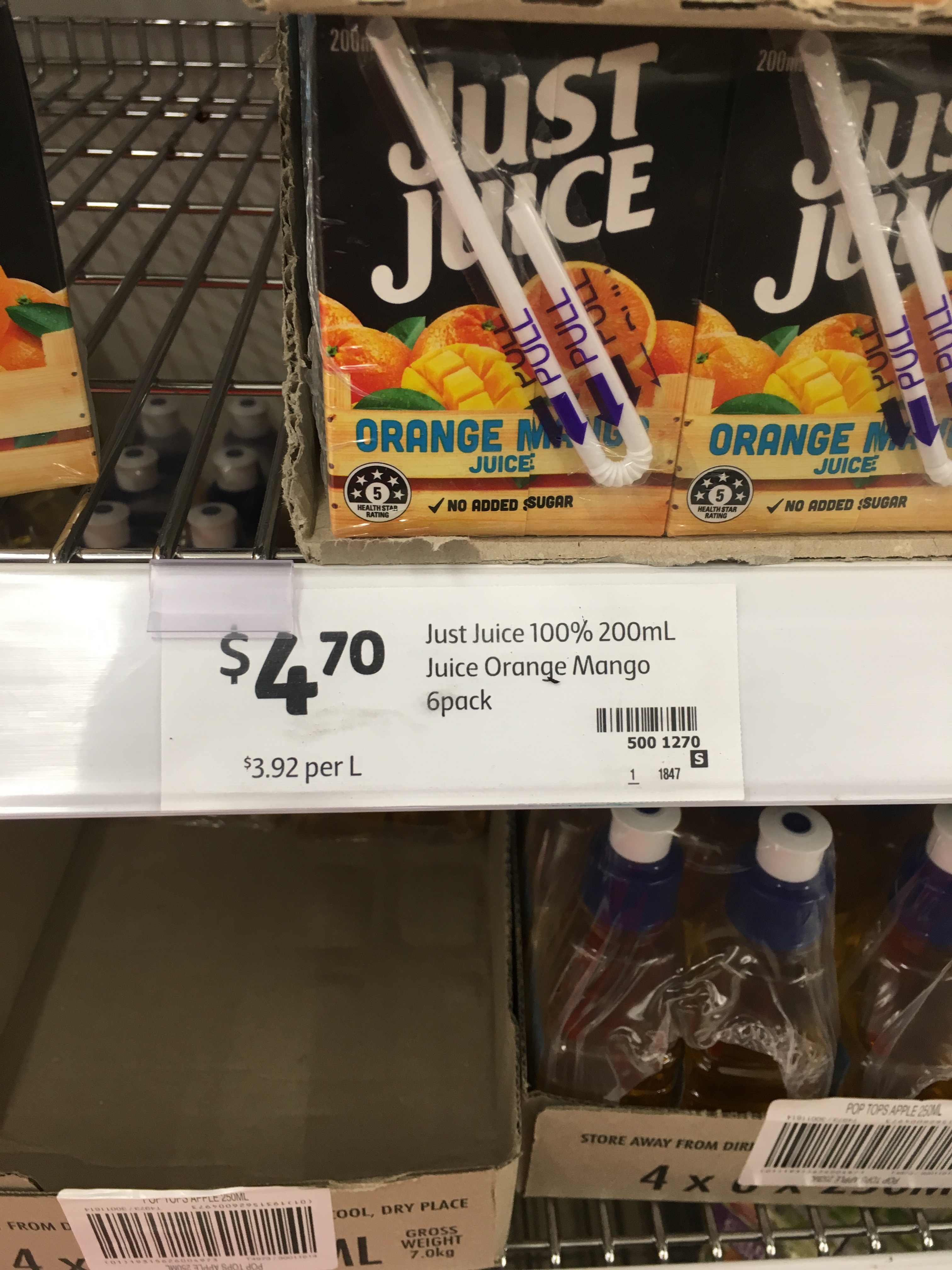
The photos were taken very recently at Brisbane supermarket at which the new and old shelf labels are being used.
I’ll put up photos of the old label in a few days time so as to not bias now anyone who wants to look at in-store and give feedback on the old and new labels (assuming that all/most stores will have both types).
The unit price on the new and old labels is located right below the selling price. However, other influences on the prominence and legibility of the unit price have changed.
I use the smartphone camera to take a pic and then enlarge as much as needed or that it can be. Saves the back and has saved my wallet contents a few times
Experience suggests that while Coles makes superficial noises about a better customer experience, there remains an underlying push to please shareholders rather than customers. It is a business after all, but there is a balance. My main gripe is simply the constant replacement of brand name products with the Coles brand. I make it a point not to buy Coles brands even though they are cheaper. I prefer an element of choice rather than constantly finding that my favourite lines have disappeared. Unit pricing is a great step forward and perhaps there should be some sort of legislative control over the sizing and placement of signs.
It is a disgrace that you have to do that, given that the ACCC administered law requires that unit prices be prominent and legible.
Paradoxically, retailers make sure that the selling price (which they are not required to provide) is always easy to notice and read. But, they do not do the same for the unit price which has to be be provided when a selling price is provided and, as indicated above, the unit price must be prominent and legible.
Hopefully, we will get beneficial changes after the coming review of the unit pricing legislation.
The unit pricing legislation has to be reviewed before 1 July 2019. During the review we will be calling for changes that will result in all unit prices being very easy for shoppers to notice and read, as well as being really close to the selling price.
One option to ensure adequate prominence and legibility of all unit prices is to require a minimum print size and perhaps also for it to be a at least a minimum % of the size of the print used for the selling price. This is done is some USA states and works well. I also favour setting the minimum print size related to the viewing distance and viewing angle.
These requirements would give retailers better and more precise guidance about what is required to achieve acceptable levels of prominence and legibility, and would make it easy for regulators to assess compliance.
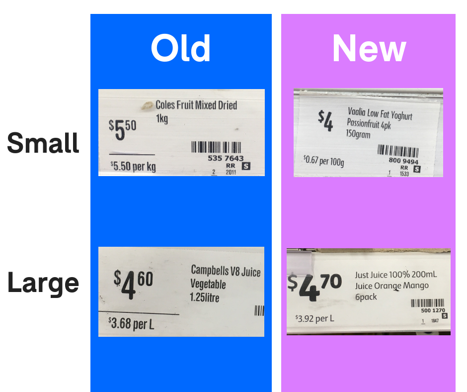
The old wins by a clear margin for consumer legibility, but the new is probably the preference of the opticians guild
It also appears there is ample room for the ‘large’ pricing even on the small tag, but that might be a quirk of or unique to these images. The underline below the price also helps focus on the unit price.
Even though the new large has a bolder price, I personally find it less legible because it appears crowded.
With the bolder Total price came a less bold unit price that appears to me to be a finer typeface.
The much bolder total then “outweighs” the finer font and as a normal human we discard the less impactful and it sort of disappears as a bit of background noise. Smart psychology in use here. The previous use of the line caused a demarcation of the items so most would “see” the unit price is those cases…to try it draw a line just above the new finer unit pricing and see if it stands out more than with no line.
Why can’t the requirement be that they are both in the same size font? Total price on left, unit price on right, and the now almost invisible product description below the line.
No doubt there will be a right vs left brain physiology reason why this will not be acceptable to Coles.
Woah, now that you’ve shown me the old tickets, I recognise the difference. I never noticed the transition! Being a young’n myself, the different fonts aren’t more difficult for me. I can certainly appreciate the fact that many in our community would have issues with the smaller unit price! I like @grahroll’s idez of taking a photo and zooming to be able to view the details. Using technology for good